
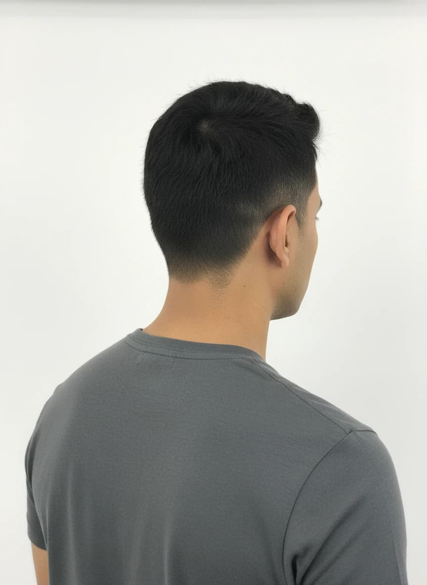
Compare color in strong daylight before you travel
Bright vacation daylight can reveal warmth, root contrast, and reflected shine that are less obvious in indoor inspiration photos. A caramel accent may look more pronounced in sun, while a soft copper can show both its brightness and any uneven fade more clearly than it does under office lighting. Compare a few shade directions on one clear portrait, then consider the destination conditions rather than assuming a favorite screen result will look identical in every scene. An AI preview is a planning tool for visual contrast; it does not guarantee how real dye chemistry responds to UV exposure, your starting hair, or the light at a particular beach, city, or resort.
- Review warmth in neutral daylight as well as indoor light.
- Compare the roots and lengths, where sun can expose contrast.
- Keep one darker or softer alternative in the travel shortlist.